
PassCheck: The Password Strength Checker
PassCheck is a JavaScript-powered password strength checker that provides real-time feedback to help users create secure passwords. It evaluates password complexity dynamically, offering color-coded strength indicators and actionable suggestions. This project demonstrates JavaScript event handling, DOM manipulation, and interactive UI validation techniques.
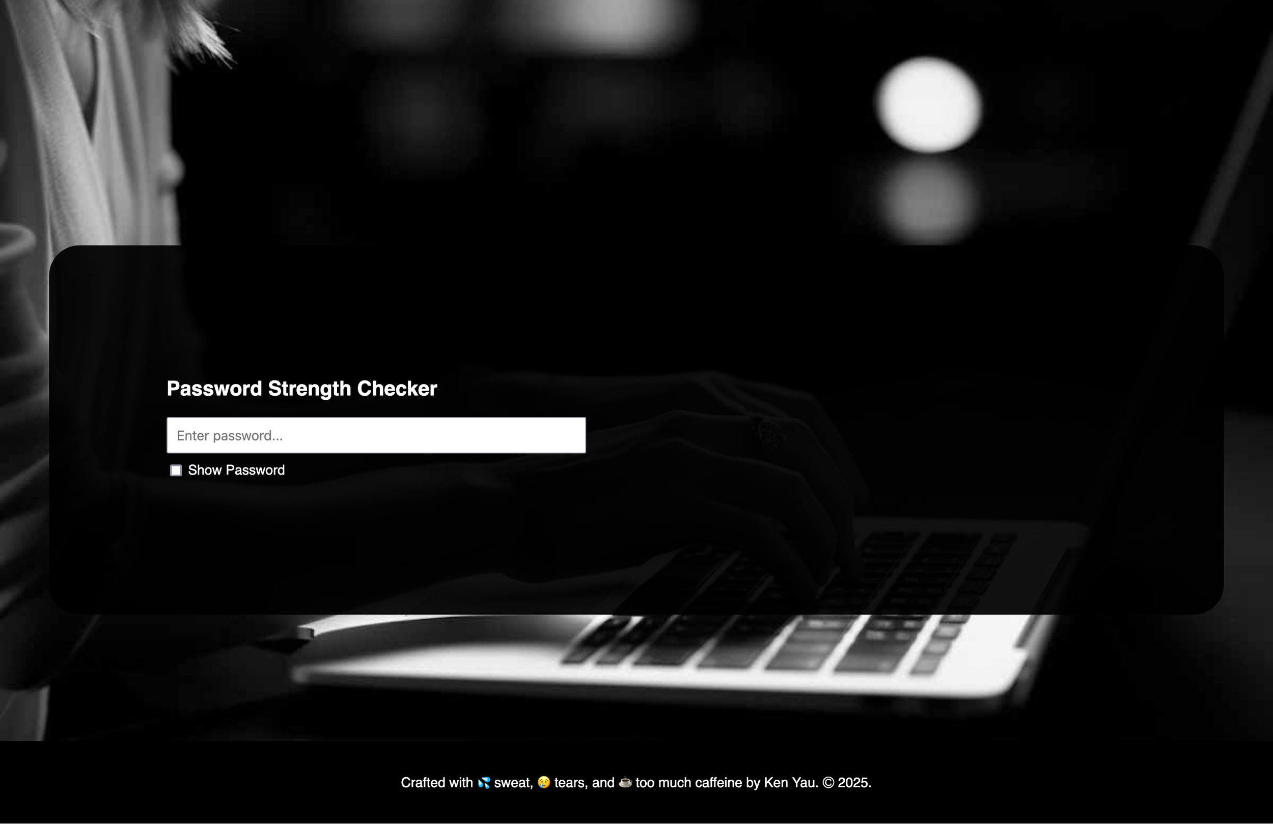
Screenshot of the PassCheck web app.
Overview
PassCheck is a lightweight, interactive password strength checker built using JavaScript, HTML, and CSS. It provides users with real-time feedback on password security by evaluating length, character variety, and complexity. A color-coded strength meter helps guide users toward creating stronger passwords.
Features
Real-time password strength evaluation (Blank, Weak, Medium, Strong).
Strength bar visualization with color-coded feedback.
Toggle password visibility for user convenience.
Validation checks for length, uppercase/lowercase, numbers, and special characters.
Mobile-responsive design for usability on all devices.
Live Demo & Screenshots


Beer & Bagel: The To-Do List Maker
Beer & Bagel is a lightweight, interactive to-do list web app built with JavaScript, HTML, and CSS. Designed for seamless task management, it allows users to add, edit, complete, and delete tasks dynamically. This project showcases JavaScript DOM manipulation, event handling, and real-time UI updates to create an intuitive, responsive experience.

A screenshot of Beer & Bagel: The To Do List Maker.
Overview
Beer & Bagel: The To-Do List Maker is a lightweight, interactive task management web app built using JavaScript, HTML, and CSS. It provides users with an intuitive way to add, edit, complete, and remove tasks dynamically.
Features
Real-time task management (add, edit, complete, delete)
DOM manipulation & event listeners for interactive UI updates
Validation handling (prevents blank or excessively long tasks)
Lightweight and mobile-friendly design
Live Demo & Screenshots


GO-OS: A Universal Car Infotainment System
GO-OS is a universal car infotainment system designed to create a seamless, distraction-free driving experience across multiple vehicle brands. By reducing cognitive load, introducing smart overlays, and incorporating gesture-based navigation, this system enhances usability while prioritizing driver safety. The project applies UX laws like Hick’s and Fitt’s Law to streamline interactions and minimize on-screen complexity, ensuring an intuitive and efficient user experience.

A mockup of GO-OS integrated into the dashboard of a car.
Overview
GO-OS (Go Operating System) is a conceptual universal car infotainment system designed to standardize the user experience across multiple vehicle brands. Unlike current infotainment systems that vary drastically between manufacturers, GO-OS aims to create a consistent, user-friendly interface that feels as intuitive as a smartphone or tablet.
Through user research, comparative analysis, and design iterations, this project focuses on minimizing driver distraction, improving accessibility, and streamlining controls for navigation, music, and climate settings.
The Problem
Lack of a Universal Infotainment Standard – Each car manufacturer uses a different UI, forcing drivers to re-learn controls when switching vehicles.
Cognitive Overload & Distraction – Poor UX leads to slow interactions, increasing risk while driving.
Inconsistent Control Placement – Some systems bury essential controls under multiple menus.
Low Engagement with Infotainment Features – Survey data revealed that many users rarely use their infotainment systems beyond basic functions.

Persona used to understand the needs of my target users for GO-OS.

Site Architecture Map for GO-OS

Conducting a comparative analysis using my friend’s Tesla.

User Flow Map for GO-OS.
The Design Process
User Research & Surveys
Target Users: Drivers aged 25-49 with moderate to high tech proficiency.
Key Findings:
Music & navigation were the most-used features.
Many drivers ignored infotainment features due to complexity.
Users wanted camera integration, real-time traffic updates, and wireless charging as additional features
Competitive Analysis
Key insights from existing systems (Tesla, Mazda, etc.):
Tesla’s infotainment is highly responsive with smooth animations.
Mazda’s system had delayed on-screen interactions, making it feel slow.
Lack of animation between screens in some systems led to disjointed UX.
Initial Wireframes & Prototyping
Created low-fidelity sketches focused on reducing clutter.
Introduced three primary widgets: Media, Navigation, and Climate Control for quick access.
Designed focused screens that expand on interaction but don’t overload the home interface.
Applying UX Laws & Cognitive Load Considerations
Hick’s Law: Reduced decision-making time by limiting choices on screen.
Gestalt Principles: Grouped related controls for a more intuitive layout.
Fitt’s Law: Made frequently used buttons larger & closer to primary touch areas for ease of use.
Final High-Fidelity UI & Iterations
Major Revisions Across Versions:
V1: Initial UI still had too many options on the home screen.
V2: Introduced a slide-in overlay system to declutter the main interface.
V3: Further minimized displayed options—added gesture-based interactions (swipe to access quick apps & overlays).
The Solution: GO-OS Features
Universal Interface – Works across multiple car brands with a consistent layout.
Smart Overlays – Slide-in panels for quick access to music, climate, and notifications.
Gesture-Based Navigation – Mimics smartphone UI for faster interactions.
Error Prevention System – Prevents the use of distracting apps while driving.
Adaptive Display – Prioritizes essential functions while in motion.

Early concept of GO-OS.

High fidelity screen for GO-OS.
Key Takeaways & Learnings
Consistency is Key – A standardized UX could improve infotainment adoption.
Minimizing Choices = Safer Driving – Reducing options enhances usability & focus.
Animations & Gestures Improve UX – Smooth transitions make interfaces feel more intuitive.
Interactive Prototype

Weero: A UX/UI Design System for Cockatiel Cottage
Weero is a UX/UI design system developed to modernize and improve the usability of Cockatiel Cottage, an older website that lacked a structured design system. The project focused on bringing consistency, accessibility, and scalability to the site’s typography, color scheme, and UI components. By refining visual hierarchy, improving readability, and creating reusable patterns, Weero transforms an outdated interface into a cohesive and user-friendly experience.

A screenshot of the living style guide for the Weero Design System, showcasing color tokens.
Overview
Weero is a structured UX/UI design guideline created to improve the user experience and branding for Cockatiel Cottage, an online resource for bird care. This design system defines typography, color palettes, UI components, and accessibility guidelines to ensure a cohesive and user-friendly interface.
The project involved a detailed site assessment of the existing website, identifying usability issues, and developing a set of design tokens, components, and reusable patterns to enhance readability, accessibility, and overall aesthetics
The Problem
Inconsistent Design & Branding – The website lacked a unified visual identity.
Poor Readability – Font choices and contrast made content hard to read.
Non-Scalable UI Elements – Buttons, forms, and layouts were inconsistent.
Accessibility Issues – Color contrast and typography choices didn’t meet modern accessibility standards.
The Process
Site Assessment & Research
Evaluated the existing Cockatiel Cottage website for usability pain points.
Conducted color contrast tests to check for accessibility issues.
Identified typography inconsistencies that impacted readability.
Establishing Design Tokens
Defined core brand elements:
Primary Brand Color – #243966 (Used for key UI elements like navigation and buttons).
Secondary & Accent Colors – Supporting colors for visual balance and hierarchy.
Typography System – Selected Poppins for clean, modern readability while incorporating a handwritten display font to preserve the original site’s character.
UI Components & Reusable Patterns
Standardized Buttons (Primary, Secondary, Tertiary) for a cohesive user experience.
Input Fields & Form Styles for consistent interactions.
Cards & Layout Patterns to ensure structured content presentation.
Accessibility & Usage Guidelines
Improved color contrast for better readability.
Defined usage examples for each component to guide consistency.
Created a structured documentation system for future scalability.
The Solution: Weero Design System Features
Unified Color Palette – Ensures a consistent brand identity across all pages.
Accessible Typography Choices – Improves readability without losing personality.
Reusable UI Components – Buttons, forms, and layout patterns for visual consistency.
Scalable & Future-Proof – Designed to be expandable as the website grows.

A reusable button component for the Weero Design System.

A pattern for a contact form for the Design System.
Key Takeaways & Learnings
The balance between personality & usability is key – Keeping the fun, casual nature of the original site while improving its usability was a challenge.
Accessibility should be prioritized from the start – Color contrast and readability improvements make a huge impact on user experience.
Design systems provide long-term scalability – Establishing reusable components and patterns ensures future design consistency.

MOAI: AI-Powered Museum Companion
MOAI is an AI-powered museum companion designed to enhance visitor engagement at the Museum of Anthropology. By integrating voice-guided tours, interactive maps, and AR scanning, MOAI transforms traditional museum experiences into immersive, accessible journeys. This project focused on user research, UX/UI design, and prototyping to create a seamless, digital-first approach to museum exploration.

A mockup of the MOIA app’s map navigation screen, showcasing how the app would provide directions for the user to navigate the museum.
Overview
MOAI is a conceptual AI-powered museum companion app designed to enhance the visitor experience at the Museum of Anthropology (MOA) at UBC. The app integrates voice-guided tours, augmented reality (AR), and interactive navigation to help visitors engage with exhibits without relying on traditional text panels.
Goal: Create an intuitive and immersive museum experience by bridging physical exhibits with digital enhancements.
The Problem
Many museum visitors struggle to fully engage with exhibits due to:
Overwhelming text panels – Large amounts of information make it difficult to stay visually focused.
Navigation challenges – Visitors often struggle to find specific exhibits in large museum spaces.
Lack of interactive learning tools – Museums rely on static signage, limiting engagement.

Comparative analysis of the SFMOMA app from my design documentation.

Also comparing the functionality of Google Lens.

And brainstorming gamification features from World of Warcraft.
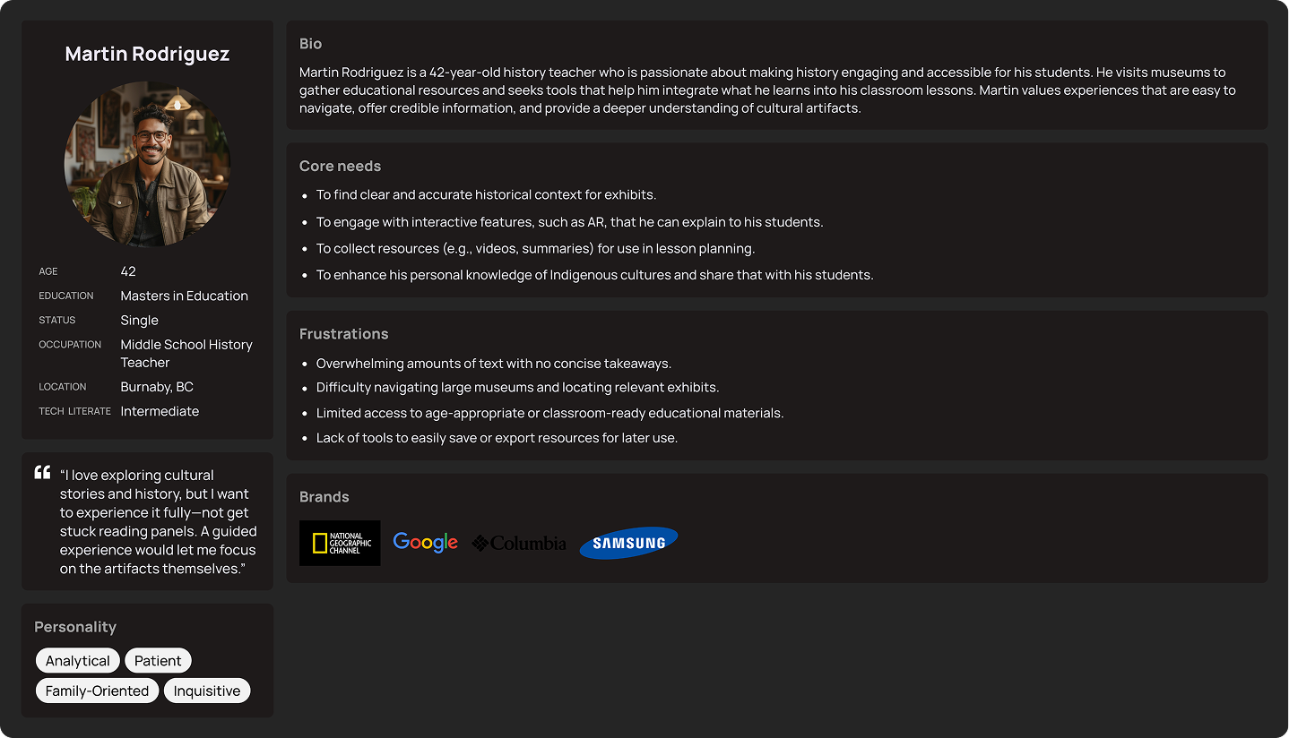
A user persona for my research for this project.

Another user persona for this project.
The Design Process
Research & User Insights
User Pain Points Identified:
Visitors want more engaging ways to explore exhibits.
Many prefer audio-based learning over reading text panels.
Museum navigation needs improvement with clearer digital maps.
User Personas & Scenarios:
I created two personas to represent key user groups:
Martin Rodriguez (42, History Teacher) – Needs an efficient way to gather information for classroom use.
Sophia Carter (28, Graphic Designer) – Seeks creative inspiration from Indigenous art exhibits.
Comparative Analysis
I analyzed existing museum and technology solutions:
SFMOMA App — Audio-guided tours based on visitor location
Google Lens — AI-powered image recognition for scanning exhibits
World of Warcraft (UI Design) — Interactive map with guided points of interest
Wireframing & UI Design
Using Figma, I designed:
User Flow Maps for guided and free exploration.
Low-Fidelity Wireframes to outline key screens.
High-Fidelity Prototypes featuring a clean, modern, accessible UI.

Mockups of the various screens of the MOIA prototype.
The Solution: MOAI Features
Voice-Guided Tours – AI-driven narration for exhibits.
Augmented Reality (AR) Scanning – Provides detailed information by scanning artifacts.
Interactive Museum Map – Helps users find exhibits easily.
Agenda Feature – Allows visitors to bookmark exhibits for later review.
Multilingual Support – Offers content in multiple languages for accessibility.
Results & Key Takeaways
Enhanced Museum Experience – Visitors can listen to explanations while visually exploring exhibits.
Streamlined Navigation – The interactive map reduces confusion and saves time.
Higher Engagement – AI-powered features increase visitor interaction.
What I Learned & Future Improvements
Balancing Digital & Physical UX – Museums require seamless integration of tech without overshadowing artifacts.
Prioritizing Accessibility – Language support and voice guidance improve inclusivity.
Efficiency in Design – Working within a short timeline taught me to prioritize core features.
Interactive Prototype

Design Bubble: A Smarter Way to Learn Design
Design Bubble is an AI-powered design encyclopedia built to simplify the way designers, students, and creatives learn design principles. Unlike traditional resources that are overwhelming or unstructured, Design Bubble curates content from multiple sources—offering concise definitions, interactive visuals, and project showcases in an engaging, easy-to-navigate format. Through research, user testing, and UI/UX design iterations, I developed a streamlined learning experience that helps users find design knowledge faster and more intuitively.

A mockup of the Design Bubble interface, and how the Trending page would look.
Overview
Design Bubble is an AI-powered design encyclopedia that curates and presents high-quality design resources in an engaging and structured format.
The goal was to create a user-friendly platform for design students, beginners, and professionals who want to explore design principles, typography, UX/UI, and visual communication—without being overwhelmed by scattered, unstructured information
The Problem
Lack of Centralized Learning Resources: Design learners often struggle to find structured, reliable content in one place.
Too Much Information, Not Enough Context: Wikipedia is text-heavy, ChatGPT lacks visual references, and Dribbble offers inspiration but no structured learning.
Beginners Feel Overwhelmed: Many aspiring designers don’t know where to start, and complex jargon creates barriers.

User Persona created to better understand my target audience for Design Bubble.

Initial sketches for Design Bubbl'e’s interfaces.

Site architecture map.

Moodboard for inspiration for Design Bubble’s theme and aesthetic.

User flow map.
The Design Process
Research & Comparative Analysis
I analyzed four major platforms—ChatGPT, Wikipedia, Dribbble, and YouTube—to understand their strengths, weaknesses, and user experience gaps.
Defining the Solution
I envisioned Design Bubble as a curated, AI-powered design encyclopedia that:
Offers concise, AI-generated summaries for easy learning
Incorporates visuals and project showcases for practical application
Provides multimedia resources (videos, articles, interactive content)
Ideation & Wireframing
Using Figma, I created:
User Personas to define user needs and frustrations
Low-Fidelity Wireframes to test layout ideas
Navigation Maps & User Flows to ensure seamless interaction
UI & Interaction Design
Moodboard Inspiration: Bright colors (blue & pink) for a fun, engaging experience
Usability Testing & Iterations
Conducted think-aloud usability tests with two test users
Identified confusing elements, including:
Unclear call-to-action (“Let’s Go!” button caused confusion)
Icons lacked clarity (Users struggled to understand tab functions)
Overuse of screen space (Elements were too large, requiring too much scrolling)
Refined navigation, hierarchy, and UI components based on feedback

Low Fidelity Wireframe.

High Fidelity home screen for Design Bubble.

Mid Fidelity Wireframe.

High Fidelity article page for the topic “Helvetica.”
The Final Product: Design Bubble Features
Smart Search Functionality – Predictive search to find design topics instantly
Structured, AI-Curated Learning – Combines summaries, visuals, and video content
Tab-Based Navigation – Organizes information into Overview, Projects, and Videos
Interactive Overlays – Displays Dribbble, YouTube, and Design Boom resources in a streamlined way